Chapter 4 Exploring data II
This unit spans Mon Feb 17 through Sat Feb 22.
At 11:59 PM on Sat Feb 22 the following items are due:
- DC 9 - Introduction to the Tidyverse: Grouping and summarizing
- DC 10 - Introduction to the Tidyverse: Types of Visualizations
This unit continues coverage of the tidyverse, specifically dplyr and ggplot2. It also presents information on visual perception and planning visualizations. In addition to the tidyverse, I’m going to load the scales and ggthemes packages. This unit has more video than usual.
4.1 Media
Reading: When did girls start wearing pink?, smithsonian.com
Video: Visual perception and size illusions (19:52), Go Cognitive / Scott Murray
Video: Religions and babies (13:20), Hans Rosling
4.2 dplyr window functions
As defined in the dplyr documentation, a window function is a variation on an aggregation function. Where an aggregation function, like sum() and mean(), takes n inputs and return a single value, a window function returns n values.
The window functions we’ll be dealing with in this class are often ranking functions (like min_rank()) and offset functions (like lag() which was introduced in the last unit). If you have ever worked with relational databases, window functions are commonly implemented in SQL.
The ranking and ordering functions you may use in dplyr are:
row_number()min_rank()which allows for gaps in ranks (e.g., if two rows are tied for first, the next rank is third)dense_rank()which doesn’t allow for gaps in ranks (e.g., if two rows are tied for first, the next rank is second)percent_rank()a number between 0 and 1 computed by rescaling min_rank to [0, 1].cume_dist()a cumulative distribution function. Proportion of all values less than or equal to the current rank.ntile()a rough rank, which breaks the input vector into n buckets
If you look at a ranking of gpa’s in the got data, 3.23 is tied for fourth place, and 2.84, which is the 6th row in the arranged data frame would be in sixth place using min_rank(), fifth place, using dense_rank()
library(dplyr)
got <- read.csv("./data/got.csv",
                stringsAsFactors = FALSE)
got %>% filter(row_number(desc(gpa)) == 6)
## lastname firstname major year gpa
## 1 Baelish Peter Communications Freshman 2.84## lastname firstname major year gpa
## 1 Baelish Peter Communications Freshman 2.84## lastname firstname major year gpa
## 1 Baelish Peter Communications Freshman 2.84We could also use the slice verb to accomplish the same thing.
##   lastname firstname          major     year  gpa
## 1 Baelish Peter Communications Freshman 2.84We’ll add the columns p_rank, c_dist and ntile to show you how the remaining ranking functions work. We’ll use four buckets for ntile()
got %>% select(lastname, firstname, gpa) %>% arrange(desc(gpa)) %>%
  mutate(p_rank = percent_rank(gpa), cdist = cume_dist(gpa),
         ntile = ntile(gpa, 4))
## lastname firstname gpa p_rank cdist ntile
## 1 Lannister Tyrion 3.83 1.0000000 1.0 4
## 2 Drogo Khal 3.38 0.8888889 0.9 4
## 3 Targaryen Daenerys 3.36 0.7777778 0.8 3
## 4 Snow John 3.23 0.5555556 0.7 3
## 5 Clegane Gregor 3.23 0.5555556 0.7 3
## 6 Baelish Peter 2.84 0.4444444 0.5 2
## 7 Stark Eddard 2.78 0.3333333 0.4 2
## 8 Tarly Samwise 2.39 0.2222222 0.3 1
## 9 Bolton Ramsay 2.24 0.1111111 0.2 1
## 10 Baratheon Joffrey 1.87 0.0000000 0.1 1The offset functions you may use in dplyr are:
lag()returns the previous value in the vector - introduced in the last unit.lead()returns the next value in a vector - the opposite oflag()
If we wanted to know the gpa of the next better lag() and next worst lead() students I would use:
##     lastname firstname          major      year  gpa nxt_better nxt_worst
## 1  Lannister    Tyrion Communications Sophomore 3.83         NA      3.38
## 2      Drogo      Khal        Zoology    Senior 3.38       3.83      3.36
## 3  Targaryen  Daenerys        Zoology  Freshman 3.36       3.38      3.23
## 4       Snow      John Nordic Studies    Junior 3.23       3.36      3.23
## 5    Clegane    Gregor        Phys Ed Sophomore 3.23       3.23      2.84
## 6    Baelish     Peter Communications  Freshman 2.84       3.23      2.78
## 7      Stark    Eddard        History    Senior 2.78       2.84      2.39
## 8      Tarly   Samwise Nordic Studies  Freshman 2.39       2.78      2.24
## 9     Bolton    Ramsay        Phys Ed  Freshman 2.24       2.39      1.87
## 10 Baratheon   Joffrey        History  Freshman 1.87       2.24        NA
We’ve covered a good portion of dplyr and most of what you’ll be using for the remainder of the semester.
4.3 Perception
Colin Ware, a professor at UNH, covers perception in great detail – in both of his books. It is relatively easy to follow visual design heuristics like “use high contrast,” and learning some rules and guidelines for constructing visualizations will go a long way to improve your skills at creating good visualizations. Understanding human visual perception takes a great deal more work but will also enhance your ability to ascertain a certain level of mastery in creating visualizations. With regards to high contrast, if we see the image below, the lion’s sand color is not in high contrast to the greenish hues of the tall grasses, yet we can spot the lion quite easily. We are genetically hardwired to see the lion as our genetic ancestry mostly doesn’t include people that could not see the lion - they were eaten.
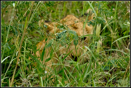
Creative Commons licensed, Flickr user Heather Bradley
Before we get too far into why we so readily see the lion and how that relates to creating good visualizations, it is essential to understand that some graphics are well understood because they are part of our visual language and are more similar to words on a page. A graphic like the one shown below would be an excellent example of this. I’ve removed the legend. Take a second and see if you can guess what this graphic is showing?
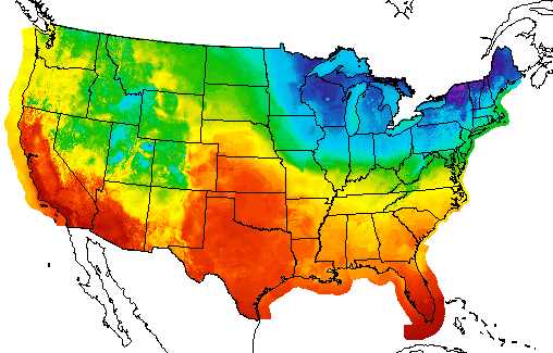 NOAA Weather Map
If you guessed that this is a temperature map for the United States, you would be correct. The reason you were able to guess what the map was is that you have seen it before. It is part of your learned language. If graphical perception was purely based on learned graphical conventions, understanding human visual perception would not be necessary in creating visualizations. One would merely spend time learning the conventions. Conventions are relevant, however observing the lion in the tall grass isn’t part of a learned language - it is sensory.
As shown in the neuroscience video with Scott Murray, explaining visual perception to the layperson, with no background in neuroscience, is difficult. Here are the simplified steps he describes in the video:
- Light enters our eye.
- Gets transduced (i.e., converted from light signals to neural signals) by our retina into visual information.
- Visual information travels to the cortex.
- Stops in the lateral geniculate nucleus in the thalamus.
- Projects directly to the cortex in an area called V1 or primary visual cortex.
- V1 to other cortical regions (e.g., V2, V3, parietal cortex, temporal lobe, etc.).
- There are upwards of 30 different visual areas in the brain.
- Perception is a complex interaction that isn’t fully understood. It also depends on what we are processing. For example, motion is processed differently than color.
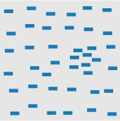
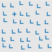
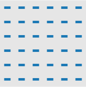
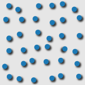
Sounds simple, right? Visual perception is an attempt by our brains to figure out what caused a pattern on our retina. In that process, the brain tries to prioritize what it thinks is important (e.g., the lion in the grass). This importance filtering is referred to as pre-attention. Look at the pattern below. Can you count how many times the number 5 appears in the list?
13029302938203928302938203858293
10293820938205929382092305029309
39283029209502930293920359203920
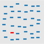
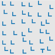
You had to attentively process the entire list to count the number of 5’s. This probably took quite a bit of time. Try counting again using the list below.
13029302938203928302938203858293
10293820938205929382092305029309
39283029209502930293920359203920
That was quite a bit easier and illustrative of preattentive processing. We told your brain what was important by using shading or color intensity. Many visual features have been identified as preattentive. Christopher G. Healy summarizes them very well in the table below copied from his site on perception in visualization. On Healy’s table, he also lists the citations for the psychology studies that examined each visual feature.
 line (blob) orientation line (blob) orientation |
 length, width length, width |
 closure closure |
 size size |
 curvature curvature |
 density, contrast density, contrast |
 number, estimation number, estimation |
 colour (hue) colour (hue) |
 intensity, binocular lustre intensity, binocular lustre |
 intersection intersection |
 terminators terminators |
 3D depth cues, stereoscopic depth 3D depth cues, stereoscopic depth |
 flicker flicker |
 direction of motion direction of motion |
 velocity of motion velocity of motion |
 lighting direction |
 3D orientation |
 artistic properties |
||
|
Table 1: A partial list of preattentive visual features. |
|||
So how does this explain our rapid identification of the lion in the tall grass? The explanation is probably quite a bit more complicated than the observable pattern shifts between the lion and her surroundings. As humans, we probably tend first to look where things might be hiding. Nonetheless, the volumes of human visual perception research help us provide some guidelines and considerations when preparing graphics.
My favorite synthesis of best uses of visual encodings is this chart, compiled by Noah Iliinksy. He gives simple guidelines for selecting visual encodings depending on the type of data you have (i.e., quantitative, ordinal, categorical, relational). Don’t think of this as hard rules. It is more like suggested guidance in selecting visual encodings. For example, NOAA does use color to represent quantitative data (temperature) even though it is not recommended. Since the use of color in weather maps is so familiar, it has become part of our visual vocabulary and is not only considered acceptable but preferred.
4.4 Planning a Visualization
Generally speaking, the starting point for planning a visualization is looking at the data. We typically want to get the data in a tidy format first. We’ll use a local dataset from data.maine.gov – Maine population by county (per decade, 1960-2010). We’ll assume I don’t have a specific question that I’m trying to answer; I want to see what might be interesting. These could include:
- counties with abnormal growth rates (high or low)
- shifts in population over time
- etc.
I’ve already downloaded and cleaned up the data to save you the trouble of going to data.maine.gov and downloading and tidying the original data.
county_pop <- read.csv("./data/maine_county_population.csv",
                stringsAsFactors = FALSE)
str(county_pop)
## 'data.frame': 96 obs. of 3 variables:
## $ county : chr "Androscoggin" "Aroostook" "Cumberland" "Franklin" ...
## $ year : int 1960 1960 1960 1960 1960 1960 1960 1960 1960 1960 ...
## $ population: int 86312 106064 182751 20069 32293 89150 28575 18497 44345 126346 ...I want to quickly see if there is a growth rate story to be told, so I’ll use ggplot2 to make small multiples for exploratory visualization. I’ll be doing one chart for each county using facets, which have their specification in the layered grammar. We’ll cover facets in more detail later in the semester. I’ll do a county by county comparison, so my aesthetics will be:
- x = year
- y = population
Because I’m interested in the growth rate, I’ll use geom_line and geom_point.
ggplot(county_pop, aes(x = year, y = population)) +
  geom_line() +
  geom_point() +
  facet_wrap(~ county)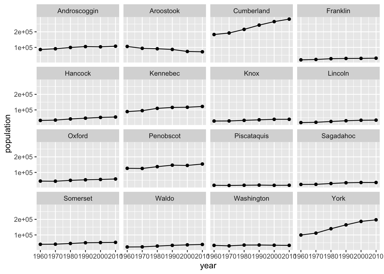
It looks like Southern Maine grew, while Northern Maine did not. That would be a compelling story to tell on a map, but for this example, since I’m not using a map I’m going to compare the two most southeastern counties (York and Cumberland) to the two most northeastern counties. I’ll still use the same aesthetics and geoms, but I’ll change county from a facet to an aesthetic – color.
ggplot(county_pop %>%
         filter(county %in% c("Aroostook", "Washington", "York", "Cumberland")),
       aes(x = year, y = population, col = county)) +
  geom_line() +
  geom_point()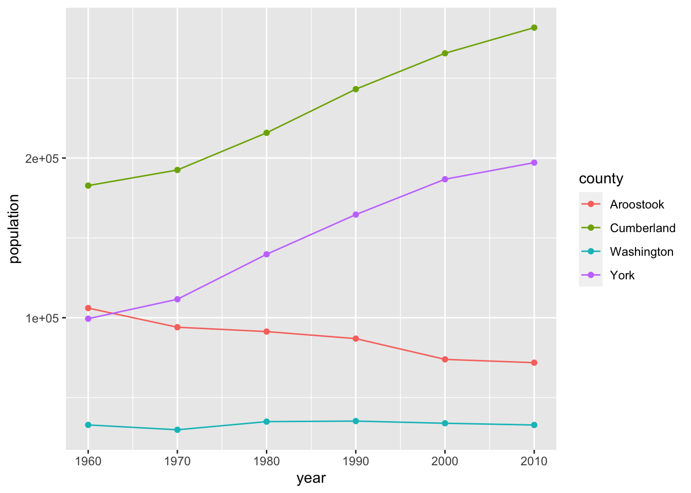
The scientific notation on the y-axis is bugging me, so I’m going to change it to actual numbers with a comma. We’ll use the scales package written by Hadley Wickham which has a convenient comma formatter. We’ll add to our layered grammar with scales. There is a variety of syntax choices for scales, but since the scientific notation that we want to change is showing on the y-axis, we’ll use the scale_y_... function where ... is continuous for a continuous variable and discrete for a discrete variable. Population is a continuous variable, so we’ll change the labels on the y-axis using scale_y_continuous(labels = comma).
ggplot(county_pop %>%
         filter(county %in% c("Aroostook", "Washington", "York", "Cumberland")),
       aes(x = year, y = population, col = county)) +
  geom_line() +
  geom_point() +
  scale_y_continuous(labels = comma)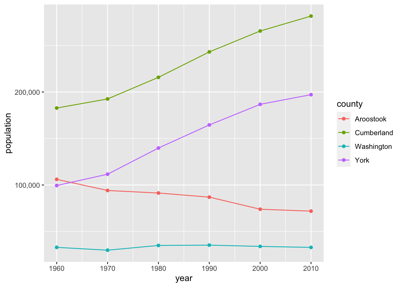
Finally, we’ll change the breaks on the y-axis to increments of 50,000 and use a red-green colorblind friendly palette. We’ll use the simple scale_color_colorblind() function from package ggthemes. You’ll notice that the color differences aren’t as easy to notice as the default ggplot2 palette. If we wanted more control or options over our colorblind palette, we could use the dichromat package or the colorblind friendly palettes from colorbrewer.org. Keep in mind that there are also computer tools for colorblind users that automatically transform colors on websites.
ggplot(county_pop %>%
         filter(county %in% c("Aroostook", "Washington", "York", "Cumberland")),
       aes(x = year, y = population, col = county)) +
  geom_line() +
  geom_point() +
  scale_y_continuous(labels = comma, breaks = c(50000, 100000, 150000, 200000, 250000)) +
  scale_color_colorblind()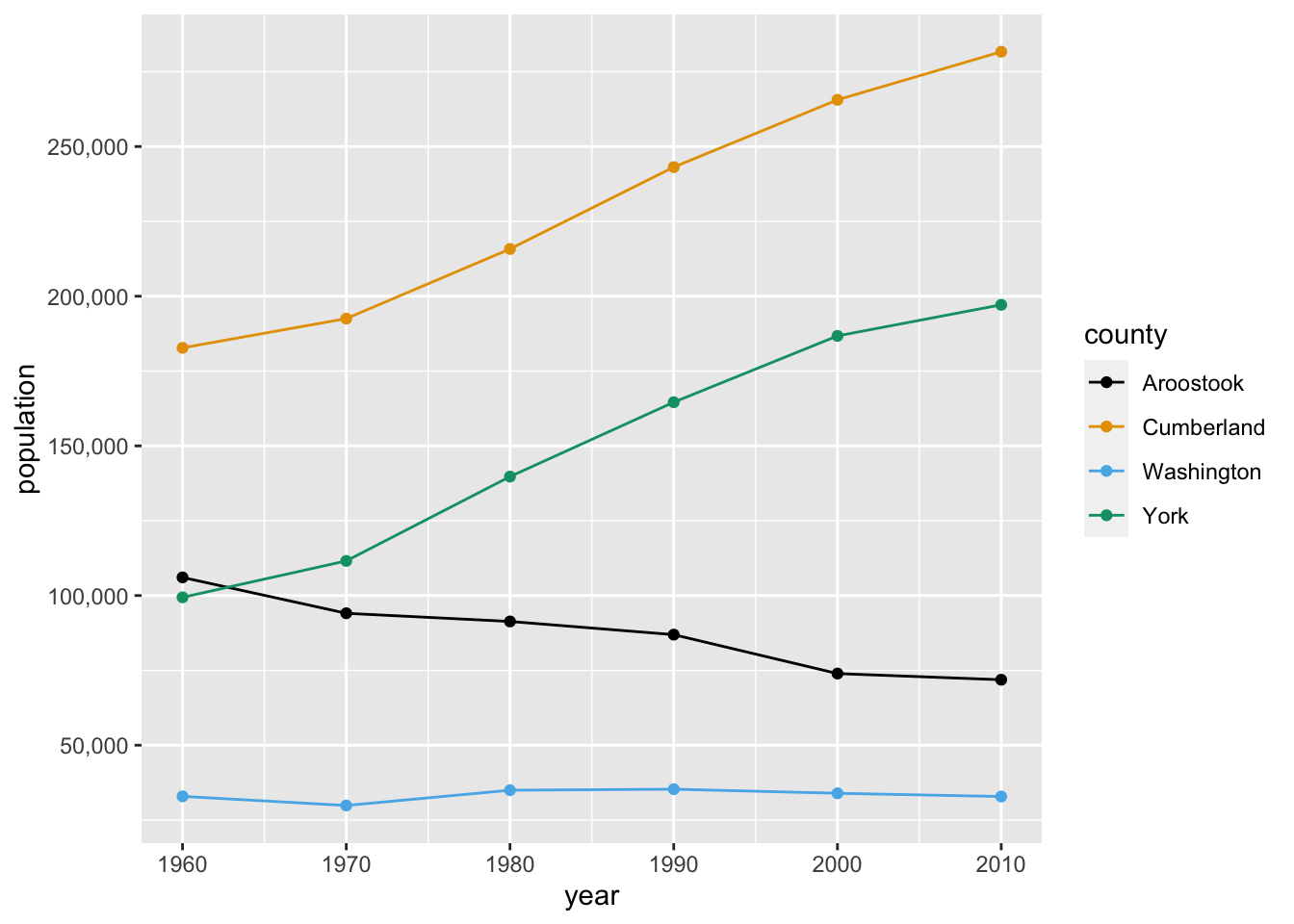
4.5 DataCamp Exercises
There are two DataCamp exercises due this unit that continue coverage of dplyr and ggplot2. These exercises will complete the DataCamp “Introduction to the Tidyverse” course. DataCamp also provides certificates for these courses and the ability to share your completion on LinkedIn, which is always a good resume-booster.
4.6 Credits
Lion photo, HeatherBradleyPhotography 

 Some rights reserved
(used with author permission)A partial list of preattentive visual features, Christopher G. Healy
Properties and Best Uses of Visual Encodings, Noah Iliinsky Some rights reserved
Color Blind Essentials, by Colblindor