Chapter 3 Exploring Data - I
This unit spans Mon Feb 10 through Sat Feb 15.
At 11:59 PM on Sat Feb 15 the following items are due:
- DC 7 - Introduction to the Tidyverse: Data wrangling
- DC 8 - Introduction to the Tidyverse: Data Visualization
Now that we’ve covered the basics of R, it is time to introduce some packages that make life a little easier when manipulating and exploring data. We’ll also use an external package to visually explore our data (i.e., create simple visualizations).
3.1 Media
- Reading: What is the tidyverse?, by Joseph Rickert
- Reading: Chapter 3: Data Visualization, Grolemund & Wickham - read through 3.4
3.2 The tidyverse
The tidyverse is a set of external R packages that work together and support the analytics workflow we introduced in the first unit. It was originally casually referred to as the “hadleyverse” as the lead developer on all the initial packages was Hadley Wickham, but he preferred to refer to these packages as the tidyverse explicitly. There are many packages in the tidyverse, but for this unit, we will be covering two of the packages that are automatically loaded when you issue the command library(tidyverse), namely dplyr for data manipulation and ggplot2 for visualization. If you like to follow along with RStudio while you read these notes, make sure you install the tidyverse package (RStudio –> Tools –> Install Package –> tidyverse) and load the library.
Before we get started with dplyr, it is important to mention that all of the tidyverse package support the pipe operator %>% which is used to chain together statements and is technically part of the tidyverse package magrittr. We’ll start out this unit by loading the core packages in the tidyverse.
3.3 dplyr
dplyr is a grammar for data manipulation that uses specific verbs to manipulate data.
it is often difficult to get used to asking questions in dplyr instead of plain English. One way to help improve your thought process is to understand the verbs of dplyr and their purpose.
selectchooses specific columns.renamerenames specific columns and selects all.filterchooses specific rows.arrangesorts rows.mutatecreates new columns.transmuteis likemutatebut doesn’t keep your old columns.distinctreturns unique rows.summarizeaggregates or chunks.sliceselects rows by position.sampletakes samples of data (seldom used).
We won’t be discussing sample as it is more commonly used in the sciences, but the other verbs are all commonly used. The other two key non-verb actions in dplyr are group_by, which is typically applied when using summarize and the pipe operator %>% which is used to combine verbs. I give a better visual representation of the queries below in the video, but let’s start by reading in a comma separated values (csv) file from a url and having a quick look at it. Note: we will learn all about importing different filetypes later in the semester.
##     lastname firstname          major      year  gpa
## 1       Snow      John Nordic Studies    Junior 3.23
## 2  Lannister    Tyrion Communications Sophomore 3.83
## 3  Targaryen  Daenerys        Zoology  Freshman 3.36
## 4     Bolton    Ramsay        Phys Ed  Freshman 2.24
## 5      Stark    Eddard        History    Senior 2.78
## 6    Clegane    Gregor        Phys Ed Sophomore 3.23
## 7    Baelish     Peter Communications  Freshman 2.84
## 8  Baratheon   Joffrey        History  Freshman 1.87
## 9      Drogo      Khal        Zoology    Senior 3.38
## 10     Tarly   Samwise Nordic Studies  Freshman 2.39
got.csv is read into the data frame got using read.csv. We’ll use the pipe operator %>% to pipe the data frame the select verb to choose specific columns (e.g., lastname, firstname, gpa). Within select, I can also change column names. Please note: I am not storing the results of these queries in any variables…I am sending them directly out to output (i.e., printing them out). Below, we are explicitly saying “take the data frame got and select the columns lastname, firstname, and gpa and while you are at it, rename the lastname column to surname.”
##      surname firstname  gpa
## 1       Snow      John 3.23
## 2  Lannister    Tyrion 3.83
## 3  Targaryen  Daenerys 3.36
## 4     Bolton    Ramsay 2.24
## 5      Stark    Eddard 2.78
## 6    Clegane    Gregor 3.23
## 7    Baelish     Peter 2.84
## 8  Baratheon   Joffrey 1.87
## 9      Drogo      Khal 3.38
## 10     Tarly   Samwise 2.39
We can use rename to change column names…it selects all the columns in the data frame. So if I wanted to show the entire data frame using the more formal surname instead of lastname, I could do the following without having to specify all of the names in select.
##      surname firstname          major      year  gpa
## 1       Snow      John Nordic Studies    Junior 3.23
## 2  Lannister    Tyrion Communications Sophomore 3.83
## 3  Targaryen  Daenerys        Zoology  Freshman 3.36
## 4     Bolton    Ramsay        Phys Ed  Freshman 2.24
## 5      Stark    Eddard        History    Senior 2.78
## 6    Clegane    Gregor        Phys Ed Sophomore 3.23
## 7    Baelish     Peter Communications  Freshman 2.84
## 8  Baratheon   Joffrey        History  Freshman 1.87
## 9      Drogo      Khal        Zoology    Senior 3.38
## 10     Tarly   Samwise Nordic Studies  Freshman 2.39
If I wanted to filter the results above to show gpa’s that are greater than or equal to 3.5, I would pipe the results to filter to choose those specific rows.
##     surname firstname          major      year  gpa
## 1 Lannister    Tyrion Communications Sophomore 3.83
If instead, I just wanted to sort the selected columns from highest to lowest gpa, I would use arrange. I use desc because the default sort order is lowest to highest.
##      surname firstname          major      year  gpa
## 1  Lannister    Tyrion Communications Sophomore 3.83
## 2      Drogo      Khal        Zoology    Senior 3.38
## 3  Targaryen  Daenerys        Zoology  Freshman 3.36
## 4       Snow      John Nordic Studies    Junior 3.23
## 5    Clegane    Gregor        Phys Ed Sophomore 3.23
## 6    Baelish     Peter Communications  Freshman 2.84
## 7      Stark    Eddard        History    Senior 2.78
## 8      Tarly   Samwise Nordic Studies  Freshman 2.39
## 9     Bolton    Ramsay        Phys Ed  Freshman 2.24
## 10 Baratheon   Joffrey        History  Freshman 1.87
Suppose I wanted to create a dean’s list column called dlist and set it to TRUE if the gpa >= 3.5 and FALSE otherwise. I would use mutate for that. Note: in this example, the column is only created in the output, and the data frame is unaltered.
##      surname firstname          major      year  gpa dlist
## 1       Snow      John Nordic Studies    Junior 3.23 FALSE
## 2  Lannister    Tyrion Communications Sophomore 3.83  TRUE
## 3  Targaryen  Daenerys        Zoology  Freshman 3.36 FALSE
## 4     Bolton    Ramsay        Phys Ed  Freshman 2.24 FALSE
## 5      Stark    Eddard        History    Senior 2.78 FALSE
## 6    Clegane    Gregor        Phys Ed Sophomore 3.23 FALSE
## 7    Baelish     Peter Communications  Freshman 2.84 FALSE
## 8  Baratheon   Joffrey        History  Freshman 1.87 FALSE
## 9      Drogo      Khal        Zoology    Senior 3.38 FALSE
## 10     Tarly   Samwise Nordic Studies  Freshman 2.39 FALSE
If I just wanted to show my transformed variables and no other variables, I could use transmute
##                  name dlist
## 1           John Snow FALSE
## 2    Tyrion Lannister  TRUE
## 3  Daenerys Targaryen FALSE
## 4       Ramsay Bolton FALSE
## 5        Eddard Stark FALSE
## 6      Gregor Clegane FALSE
## 7       Peter Baelish FALSE
## 8   Joffrey Baratheon FALSE
## 9          Khal Drogo FALSE
## 10      Samwise Tarly FALSE
If we wanted to list the majors represented in the got data frame, we would use distinct, which restricts to unique(distinct) output.
##            major
## 1 Nordic Studies
## 2 Communications
## 3        Zoology
## 4        Phys Ed
## 5        History
Aggregation often adds the most complexity to a query, and it is quite common to see summarize combined with group_by. For example, if we wanted to show the average gpa for each major, we would use group_by to declare that we are doing a calculation for each major and use summarize to define the mean calculation. You’ll notice that instead of a data frame, we are outputting a tibble, which is essentially an enhanced data frame that can store more complex data.
## # A tibble: 5 x 2
##   major          average_gpa
##   <chr>                <dbl>
## 1 Communications        3.34
## 2 History               2.33
## 3 Nordic Studies        2.81
## 4 Phys Ed               2.74
## 5 Zoology               3.37
Suppose we wanted to show the name of the student with the highest gpa for each major. We could do this in a few different ways. In all cases, since we are doing it for each major, we will be using group_by(major). In the first case, after grouping, we sort in descending gpa order and slice out the first(1) instance of each student.
## # A tibble: 5 x 5
## # Groups:   major [5]
##   lastname  firstname major          year        gpa
##   <chr>     <chr>     <chr>          <chr>     <dbl>
## 1 Lannister Tyrion    Communications Sophomore  3.83
## 2 Stark     Eddard    History        Senior     2.78
## 3 Snow      John      Nordic Studies Junior     3.23
## 4 Clegane   Gregor    Phys Ed        Sophomore  3.23
## 5 Drogo     Khal      Zoology        Senior     3.38
In the second case, we decide we want to use the top_n function.
## Selecting by gpa## # A tibble: 5 x 5
## # Groups: major [5]
## lastname firstname major year gpa
## <chr> <chr> <chr> <chr> <dbl>
## 1 Lannister Tyrion Communications Sophomore 3.83
## 2 Drogo Khal Zoology Senior 3.38
## 3 Snow John Nordic Studies Junior 3.23
## 4 Clegane Gregor Phys Ed Sophomore 3.23
## 5 Stark Eddard History Senior 2.78In the third case, we use the min_rank function within filter.
## # A tibble: 5 x 5
## # Groups:   major [5]
##   lastname  firstname major          year        gpa
##   <chr>     <chr>     <chr>          <chr>     <dbl>
## 1 Snow      John      Nordic Studies Junior     3.23
## 2 Lannister Tyrion    Communications Sophomore  3.83
## 3 Stark     Eddard    History        Senior     2.78
## 4 Clegane   Gregor    Phys Ed        Sophomore  3.23
## 5 Drogo     Khal      Zoology        Senior     3.38
This should seem somewhat confusing, and perhaps it is best to describe what is going on here. top_n is an easier to use “wrapper” function that combines filter and min_rank. slice was added later to dplyr to make it simpler not just to select the top. For example, if I wanted to select positions 2 through 4, I would use slice(2:4) There is no equivalent top_n for this, and I would end up resorting to the harder to follow filter(min_rank(...) %in c(2:4) To simplify, you should try to get comfortable with slice but feel free to use top_n as well.
3.4 ggplot2
We aren’t wired to look at tons of numbers. In analytics, we tend to use visualizations to understand our data and observe patterns quickly. One of R’s primary strengths is its visualization libraries. For static visualizations, ggplot2 is possibly the most commonly used library.
We often think of visualizations as a way to tell stories to others involving data. In this case, we are merely using visualization to explore our data. With exploratory visualizations, we aren’t that focused on formatting and ease of interpretation by others because they are for our private consumption. As we’ll learn this semester, ggplot2 is commonly used for both exploratory visualizations and to communicate results.
3.5 Grammar of graphics
Base R graphics are conceptually like working from a blank canvas. If you’ve used Microsoft Excel to create a visualization, you typically select a chart from a library. Leland Wilkinson published The Grammar of Graphics in 1999 and described a framework for constructing visualizations. This structured framework falls nicely in between the unstructured blank canvas and the rigid “select a chart” model. The “gg” in ggplot2 actually stands for grammar of graphics. Another commonly used visualization software application, Tableau, also uses the grammar of graphics as a framework (Leland Wilkinson was the VP of Statistics for Tableau). It is important to note that this grammar doesn’t help you select what visualizations to use, it merely helps you construct them.
There are three critical components for every ggplot2 plot.
- data
- a set of aesthetic mappings between variables in the data and visual properties, and
- at least one layer which describes how to render each observation. Layers are usually created with a
geomfunction.
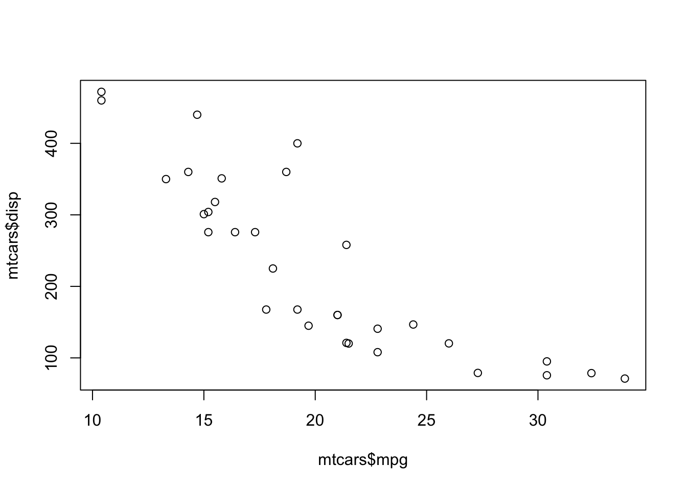
First, we’ll take a look at a base graphics scatterplot of miles per gallon(mpg) and displacement(disp) using the built-in mtcars data frame:
If I want to create a similar visualization in ggplot2, I would start with the data and the aesthetics (aes) using the ggplot function.
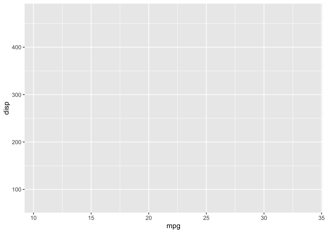
You’ll notice that there aren’t any points in our graph. That is because we have yet to create a layer to render the observations. Recall that we typically use a geom function for this. Scatterplots are rendered using geom_point.
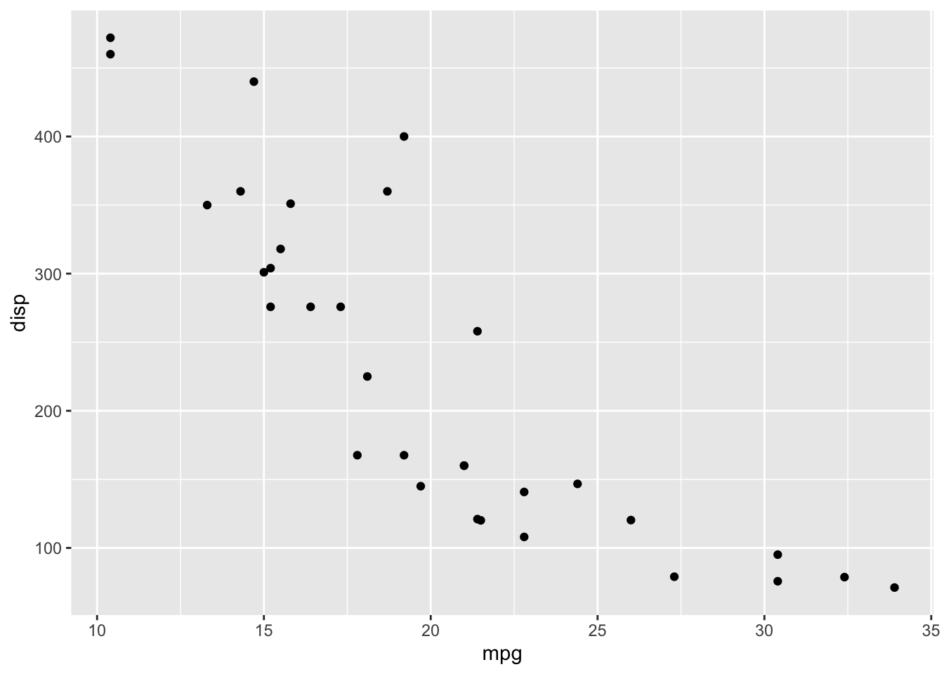
Looking back at the layered grammar we created:
- data -
mtcars - aesthetics - we map
mpgto the x-axis anddispto the y-axis - layer - we use points as the geometric object to render the values
You’ll probably notice that the visualization is a little more refined than the one we created with plot. One of the benefits of using ggplot2 is that the defaults are really good.
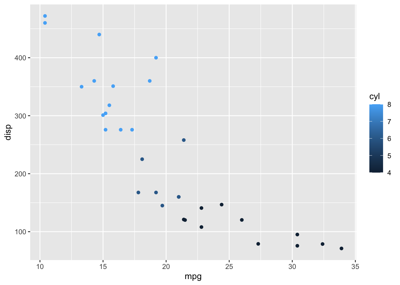
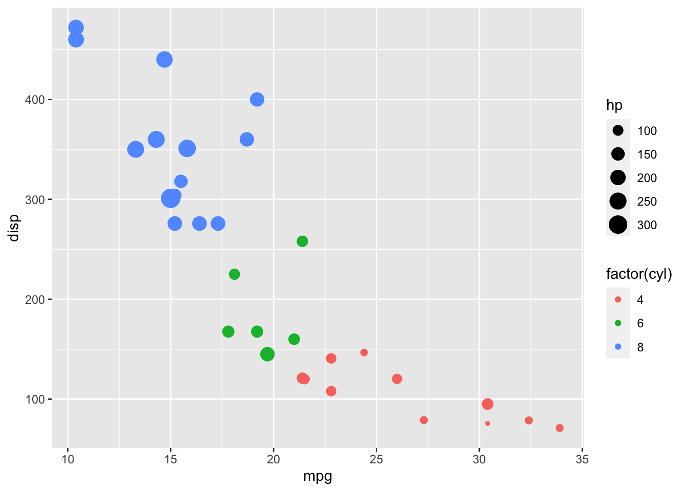
We can also apply other aesthetic mappings to our visualization, like mapping cylinder to color:
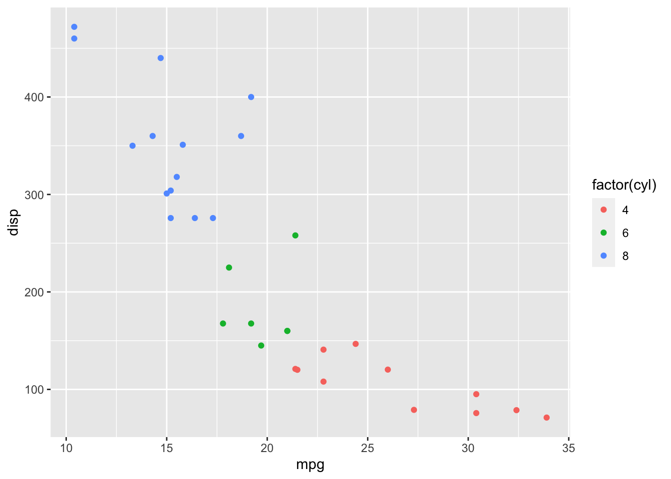
I used factor to effectively treat displacement as a factor (i.e., enumerated or categorical) variable. This creates a potentially more diverging color scheme and prevents a legend that might include values that don’t exist in the data (shown below without the use of factor).
Some other aesthetic mappings include size:
…and shape:
ggplot(data = mtcars, aes(x = mpg, y = disp, color = factor(cyl), size = hp, shape = factor(gear))) +
  geom_point()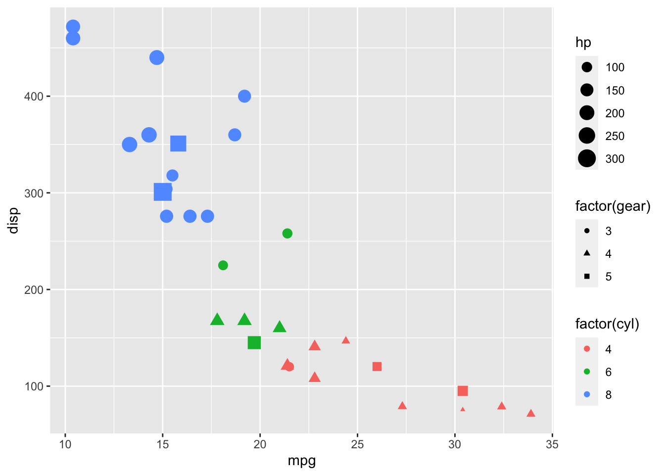
The aesthetics we use are somewhat dependent on how we choose to encode our data. Some aesthetics not used or not applicable here are fill, linetype, weight, alpha, and text. The visualization above is somewhat difficult to comprehend, and we might be better off rethinking what data we want to show and how we want to communicate it.
There are also a variety of geoms for bars, boxplots, smoothing lines, and others that you can use, some of which we will cover thoughout the semester.
The remaining grammatical elements that we have yet to cover, are:
- The
scales map values in the data space to values in an aesthetic space, whether it be color, or size, or shape. Scales draw a legend or axes, which provide an inverse mapping to make it possible to read the original data values from the plot. - A coordinate system,
coordfor short, describes how data coordinates are mapped to the plane of the graphic. It also provides axes and gridlines to make it possible to read the graph. We normally use a Cartesian coordinate system, but some others are available, including polar coordinates and map projections. - A
faceting specification describes how to break up the data into subsets and how to display those subsets as small multiples. This is also known as conditioning or latticing/trellising. - A
themewhich controls the finer points of display, like the font size and background colour. While the defaults in ggplot2 have been chosen with care, you may need to consult other references to create an attractive plot. A good starting place is Edward Tufte’s early works (Tufte, 1990, 1997, 2001).
3.6 DataCamp Exercises
The DataCamp exercises you are assigned cover both dplyr and ggplot2 in different ways than the lecture notes do. This breadth of coverage should help solidify your knowledge of these core packages which we’ll use throughout the semester. Both of these packages will also help clarify your thinking when manipulating data and visualizing it. This will make it easier to work with any data manipulation and visualization tools, including Excel.