Chapter 5 Communicating Visually
This unit spans Mon Feb 24 through Sat Feb 29.
At 11:59 PM on Sat Feb 29 the following items are due:
- DC 11 - Communicating with Data in the Tidyverse: Custom ggplot2 themes
- DC 12 - Communicating with Data in the Tidyverse: Creating a custom and unique visualization
We’ll continue our exploration of the tidyverse with a specific focus on preparing reports containing data and visualizations for others. dplyr and ggplot2. In the notes, I’ll show you how to use the forcats package fct_reorder to change levels in graphs. In the videos, I’ll do the same using dplyr’s mutate function instead. There are often lots of ways to do the same thing in R.
5.1 Media
- Reading: What makes a chart boring?, Stephen Few
- Reading: Misleading graph, Wikipedia
5.2 joining data
Before we jump into communicating data, I want to cover a technique that is often used in analytics – joining data. We’ll use the babynames database to illustrate. I am a male born in 1967. You probably listened to people from my generation start out stories with “back in my day,” and usually expound on how much more difficult some aspect of life was. I’ll continue the tradition…
Back in my day, people in the US weren’t as creative in naming their children. Apparently, they picked mostly New Testament, Christian names because that is what most other people were named in this country and there was potentially more pressure to conform. My name is the third most popular baby name from 1967 and The top five names made up nearly 20% of all the male names that year.
## Selecting by prop## # A tibble: 5 x 5
## year sex name n prop
## <dbl> <chr> <chr> <int> <dbl>
## 1 1967 M Michael 82445 0.0463
## 2 1967 M David 66808 0.0375
## 3 1967 M James 61699 0.0347
## 4 1967 M John 61623 0.0346
## 5 1967 M Robert 56380 0.0317top_n also sends a message stating which variable it is using to determine the top n observations.
Compare that to 2013, which is the most recent year from the babynames package. We see an influx of Old Testament names like Noah and Jacob, non-religious names like “Mason” and shortened names like “Liam.” Even more important is that the top five names combined don’t even account for five percent of all males born in 2013, which is one-quarter of the cumulative proportion of the top five names from 1967. Just by looking at that statistic, we can pretty much tell that there is likely far less conformity in naming male children in 2013 vs. 1967.
## Selecting by prop## # A tibble: 5 x 5
## year sex name n prop
## <dbl> <chr> <chr> <int> <dbl>
## 1 2013 M Noah 18241 0.00904
## 2 2013 M Jacob 18148 0.00900
## 3 2013 M Liam 18131 0.00899
## 4 2013 M Mason 17688 0.00877
## 5 2013 M William 16633 0.00825Except for William, the top five names in 2013 were not at all popular in 1967.
## # A tibble: 20 x 5
##     year sex   name        n      prop
##    <dbl> <chr> <chr>   <int>     <dbl>
##  1  1967 M     Michael 82445 0.0463
##  2  1967 M     David   66808 0.0375
##  3  1967 M     James   61699 0.0347
##  4  1967 M     John    61623 0.0346
##  5  1967 M     Robert  56380 0.0317
##  6  1967 M     William 37621 0.0211
##  7  1967 M     Jacob     451 0.000253
##  8  1967 M     Noah      156 0.0000876
##  9  1967 M     Mason      87 0.0000489
## 10  1967 M     Liam       60 0.0000337
## 11  2013 M     Noah    18241 0.00904
## 12  2013 M     Jacob   18148 0.00900
## 13  2013 M     Liam    18131 0.00899
## 14  2013 M     Mason   17688 0.00877
## 15  2013 M     William 16633 0.00825
## 16  2013 M     Michael 15491 0.00768
## 17  2013 M     James   13552 0.00672
## 18  2013 M     David   12348 0.00612
## 19  2013 M     John    10704 0.00531
## 20  2013 M     Robert   6708 0.00333
You’ll notice I used the %in% clause to show the top five from each period’s popularity in 1967. Let’s assume I want to answer the following questions:
- what are the top five male names that appear in both 1967 and 2013? - to keep it simple I’ll use totals and not proportions
- what are the top five male names from 1967 that don’t appear in 2013?
- what are the top five male names from 2013 that don’t appear in 1967?
5.2.1 inner joins
To answer the question: what are the top five names that appear in both 1967 and 2013?; I’m going first to create a data frame that joins the two periods. I’ll take multiple steps to illustrate, but I can make this syntactically simpler. inner_join creates a new data frame that “joins” the two objects by preferably some unique field that exists in both data frames, in this case, name.
males_1967 <- babynames %>% filter(year == 1967, sex == "M")
males_2013 <- babynames %>% filter(year == 2013, sex == "M")
males_both <- males_1967 %>% inner_join(males_2013, by = "name")
head(males_both)
## # A tibble: 6 x 9
## year.x sex.x name n.x prop.x year.y sex.y n.y prop.y
## <dbl> <chr> <chr> <int> <dbl> <dbl> <chr> <int> <dbl>
## 1 1967 M Michael 82445 0.0463 2013 M 15491 0.00768
## 2 1967 M David 66808 0.0375 2013 M 12348 0.00612
## 3 1967 M James 61699 0.0347 2013 M 13552 0.00672
## 4 1967 M John 61623 0.0346 2013 M 10704 0.00531
## 5 1967 M Robert 56380 0.0317 2013 M 6708 0.00333
## 6 1967 M William 37621 0.0211 2013 M 16633 0.00825You’ll notice that the “.x” represents 1967 data, and the “.y” represents 2013. I can add n.x and n.y to get a total, but I’m assuming things won’t change that much from 1967 due to the high concentration of names.
## Selecting by n## # A tibble: 5 x 2
## name n
## <chr> <int>
## 1 Michael 97936
## 2 David 79156
## 3 James 75251
## 4 John 72327
## 5 Robert 63088Yep…the addition of the 2013 names didn’t even budge the order. The next question is more interesting…
What are the top five male names from 1967 that don’t appear in 2013?
We can’t use our joined data to answer this because that data frame explicitly contains names that only occur in both periods. To accomplish this, we need to do an outer join.
5.2.2 outer joins
In dplyr, a left_join joins two tables using all the data from the “left” table and only matching data from the right table, so if I want to use all of the 1967 names, I make sure that table is syntactically to the left of left_join
## # A tibble: 6 x 9
##   year.x sex.x name       n.x     prop.x year.y sex.y   n.y      prop.y
##    <dbl> <chr> <chr>    <int>      <dbl>  <dbl> <chr> <int>       <dbl>
## 1   1967 M     Young        5 0.00000281   2013 M         8  0.00000397
## 2   1967 M     Zbigniew     5 0.00000281     NA <NA>     NA NA
## 3   1967 M     Zebedee      5 0.00000281   2013 M        10  0.00000496
## 4   1967 M     Zeno         5 0.00000281   2013 M        14  0.00000694
## 5   1967 M     Zenon        5 0.00000281   2013 M        12  0.00000595
## 6   1967 M     Zev          5 0.00000281   2013 M       160  0.0000793
Looking at the last few names alphabetically, we can the name Zbigniew was used in 1967 and not in 2013 (evident by the NA values in the "*.y" columns). So rewording the question in r-speak, what we are asking is:
Show me the five highest n.x values for names where n.y is NA.
## Selecting by n.x## # A tibble: 5 x 2
## name n.x
## <chr> <int>
## 1 Bart 534
## 2 Tod 303
## 3 Kraig 172
## 4 Lon 162
## 5 Kirt 155We have uncovered a reverse-Simpsons-effect. Nobody in 2013 named their son Bart!
To do the same for the 2013 data, we can either put the 2013 table to the left of the left_join, or the right of a right_join.
males_both_2013 <- males_1967 %>% right_join(males_2013, by = "name")
males_both_2013 %>% filter(is.na(n.x)) %>% select (name, n.y) %>% top_n(5)
## Selecting by n.y## # A tibble: 5 x 2
## name n.y
## <chr> <int>
## 1 Jayden 14756
## 2 Aiden 13615
## 3 Jaxon 7549
## 4 Brayden 7438
## 5 Ayden 6069It looks like we can refer to 2013 as "the rise of the *dens." It also appears that maybe my rush to label 2013 as “less conformist” may be wrong.
We could have answered both of these questions doing a single full outer join as well.
males_both_full <- males_1967 %>% full_join(males_2013, by = "name")
males_both_full %>% filter(is.na(n.y)) %>% select (name, n.x) %>% top_n(5)
## Selecting by n.x## # A tibble: 5 x 2
## name n.x
## <chr> <int>
## 1 Bart 534
## 2 Tod 303
## 3 Kraig 172
## 4 Lon 162
## 5 Kirt 155## Selecting by n.y## # A tibble: 5 x 2
## name n.y
## <chr> <int>
## 1 Jayden 14756
## 2 Aiden 13615
## 3 Jaxon 7549
## 4 Brayden 7438
## 5 Ayden 60695.3 Design Guidelines
Let’s look at one of the visual encodings described in Iliinsky’s table – size, area. He has it listed as “Good” for quantitative values. If we compare this to Few’s use of “points of varying size,” we can see that Few only recommends this for geospatial data, specifically to pinpoint specific locations for entire regions. Part of this difference is due to the two people using different classification systems for visual encodings. “Size, area” is an expansive concept and you might think that there is some overlap between that category and Few’s categories of “Horizontal and Vertical Bars/Boxes.” For horizontal and vertical bars, it is the length that allows us to make the comparison so the “size, area” category doesn’t really overlap here. Horizontal and vertical box plots do have a slight area component to them but, once again, most of the preattentive processing is accomplished by the length and the line markers on the box plots.
A common example of using size to encode quantitative information is the bubble chart (shown below).
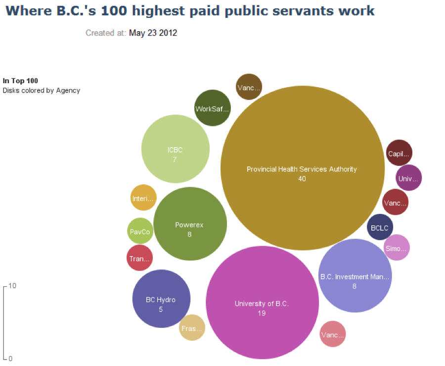
The chart shows what agencies the top 100 public servants in British Columbia worked in 2012. Size represents the count of public servants at that particular agency. I don’t think Iliinsky would be particularly fond of this chart. Stephen Few expresses his displeasure with it in a blog post. There probably is a nuanced difference between Few and Iliinsky on the applicability of bubble charts to static graphs which further illustrates the point that the visual encoding guidelines provided by both authors are suggestions, not law.
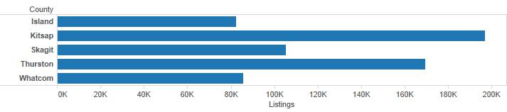
For bar and column charts, you should only use points when the quantitative scale does not begin at zero. In general, you should have good reason not to have a zero start point as this can lead to a misleading graph. If we want to compare home sales for select Puget Sound counties, county is categorical (technically it is also geographic, but we aren’t mapping right now). We use the length of the bars to make comparisons. Kitsap county looks like it had about 2.4 times as many listings as Island county because the bar is roughly 2.4 times longer.
Let’s assume that for some reason, my quantitative scale doesn’t begin with zero (note: you should be extremely suspicious when you see this). The chart below becomes exceptionally misleading because now it appears as though Kitsap county has over ten times the listings of Island County.
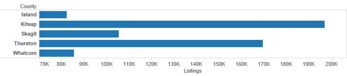
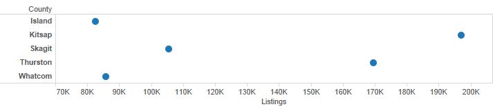
You should never let this happen. If for some reason you are forced into using a non-zero start point (this sometimes happens in journalism), then you should use something that doesn’t force our brain into making comparisons via length or area. A dot plot is shown below, but the first bar chart is still the best option in this case.
5.4 geom selection
We are going to look at Rolling Stone’s 500 greatest albums of all time (1955-2011) from cooldatasets.com. I’ve made a copy locally.
top_albums <- read.csv("./data/Rolling_Stones_Top_500_Albums.csv", stringsAsFactors = FALSE)
head(top_albums)
## Number Year Album Artist Genre
## 1 1 1967 Sgt. Pepper's Lonely Hearts Club Band The Beatles Rock
## 2 2 1966 Pet Sounds The Beach Boys Rock
## 3 3 1966 Revolver The Beatles Rock
## 4 4 1965 Highway 61 Revisited Bob Dylan Rock
## 5 5 1965 Rubber Soul The Beatles Rock, Pop
## 6 6 1971 What's Going On Marvin Gaye Funk / Soul
## Subgenre
## 1 Rock & Roll, Psychedelic Rock
## 2 Pop Rock, Psychedelic Rock
## 3 Psychedelic Rock, Pop Rock
## 4 Folk Rock, Blues Rock
## 5 Pop Rock
## 6 SoulIt looks like this dataset is mostly categorical data with Year and Number being exceptions. Let’s first see how the genres are distributed. If I don’t map a variable to the y axis, geom_bar will take discrete categorical variables and create a bin for each one and then provide a count for each discrete category. This can be explicitly specified by setting the attribute stat = bin but it is the default behavior for geom_bar.
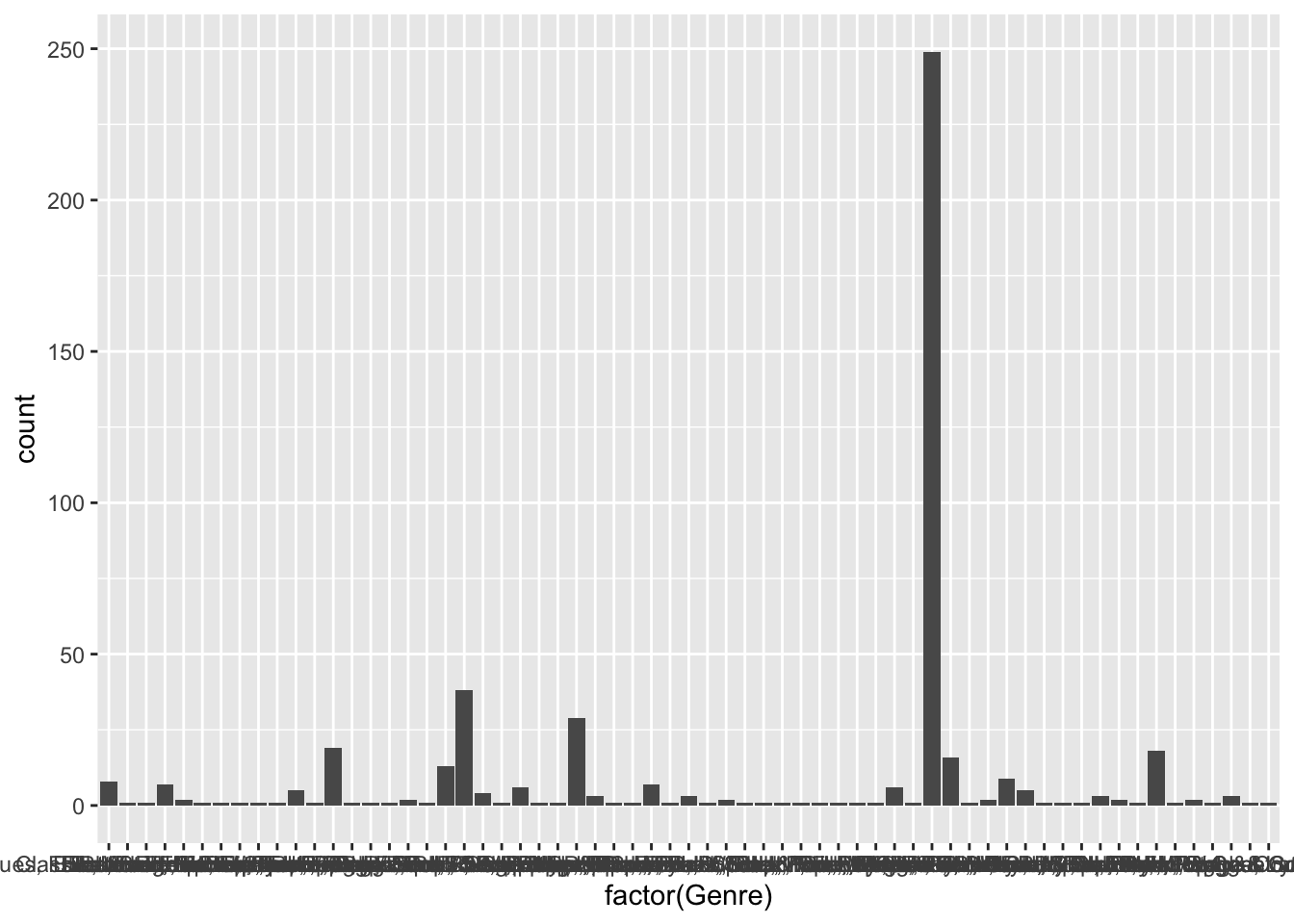
That is far more genres than I thought there would be. Let’s take a look at the top five genres. geom_bar’s default behavior is to place a count of data (i.e., stat = bin) on the y axis. In this case, we’ll use dplyr to pre-aggregate our data and we don’t want ggplot to attempt to count it. We switch to stat = identity to represent the value in the data frame rather than a count of occurrences.
top_5_genres <- top_albums %>% group_by(Genre) %>%
  summarize(count = n()) %>% arrange(desc(count)) %>%
  top_n(5)
ggplot(data = top_5_genres, aes(x = Genre, y = count)) +
  geom_bar(stat = "identity") +
  coord_flip()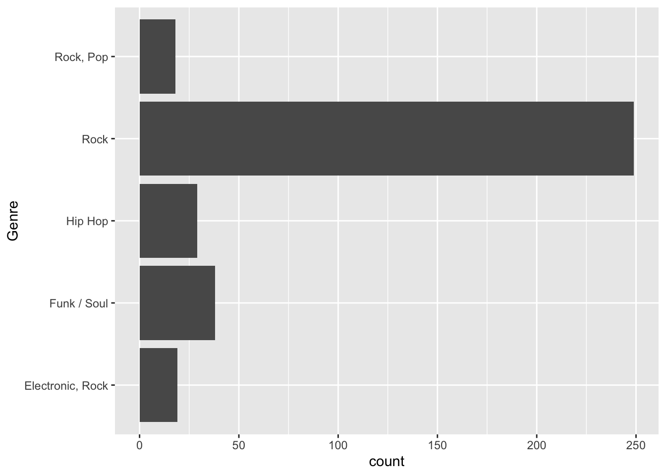
You might have noticed that even though I created top_5_genres with a descending sort, ggplot2 doesn’t arrange the categories in this manner. We’ll take a look at top_5_genres first.
## Classes 'tbl_df', 'tbl' and 'data.frame':    5 obs. of  2 variables:
##  $ Genre: chr  "Rock" "Funk / Soul" "Hip Hop" "Electronic, Rock" ...
##  $ count: int  249 38 29 19 18
Genre has not been defined as a factor and ggplot has no way to order it unless it is defined as a factor. We’ll use the fct_reorder function within mutate in the following manner:
fct_reorder(categorical_variable, sorted_quantitative_variable_to_order_by) or, in other words,
fct_reorder(Genre, count)
ggplot(data = top_5_genres, aes(x = fct_reorder(Genre, count, .desc = TRUE), y = count)) +
  geom_bar(stat = "identity") +
  xlab("Genre") +
  coord_flip()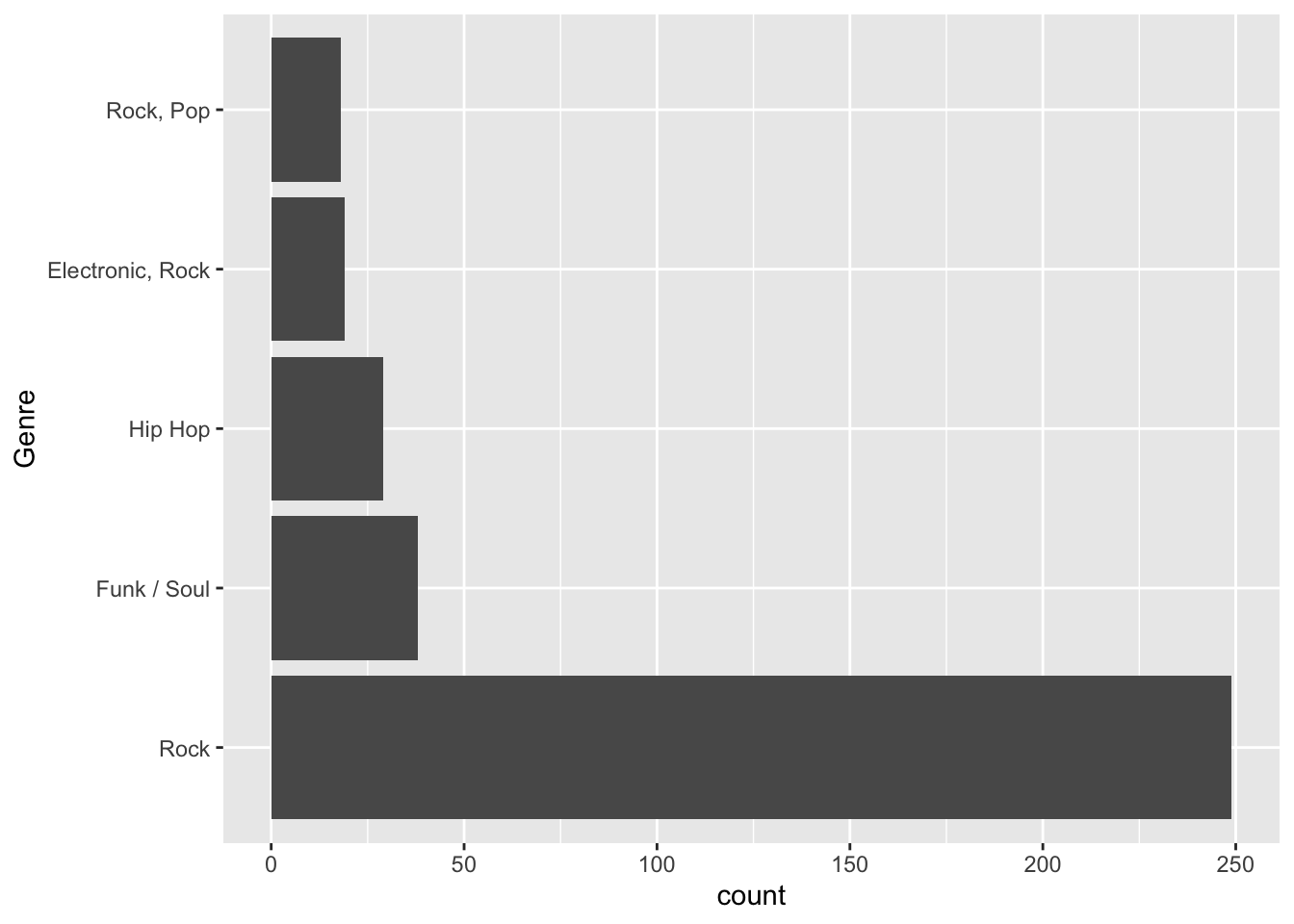
You might be inclined also to encode Genre by color. I’m not a big fan of this in that the color would serve no useful purpose. You would be better off using color as an attribute here and not an aesthetic.
ggplot(data = top_5_genres, aes(x = fct_reorder(Genre, count, .desc = TRUE), y = count)) +
  geom_bar(stat = "identity", fill = "darkgreen") +
  xlab("Genre") +
  coord_flip()
In the last couple of charts, we used geom_bar with stat = "identity" to help reinforce the difference between that and stat = "bin". ggplot2 also has the geom geom_col that was explicitly designed for bar charts using values (i.e., the default is identity instead of bin). We could recreate the last chart in a slightly more straightforward manner as shown below.
ggplot(data = top_5_genres, aes(x = fct_reorder(Genre, count, .desc = TRUE), y = count)) +
  geom_col(fill = "darkgreen") +
  xlab("Genre") +
  coord_flip()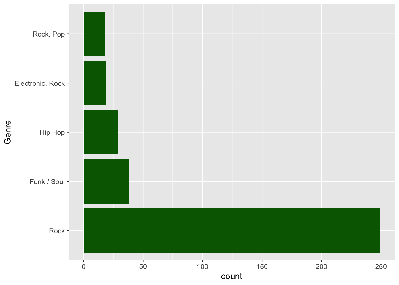
Suppose we wanted to examine the count of top 500 records by year. Typically we show time series on the x-axis so we might do something like:
## `stat_bin()` using `bins = 30`. Pick better value with `binwidth`.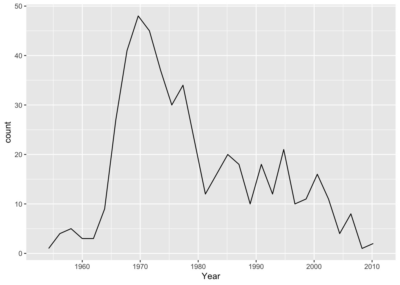
Video did indeed kill the radio star. I had to specify stat = bin in this case because geom_line uses stat = identity by default. Because I didn’t create an aesthetic for y, there is no identity value. You’ll also notice I get a warning informing me that it is creating 30 bins, which ends up misrepresenting the data because I likely have more than 30 discrete years given that the data runs from 1955 - 2011. The suggestion to Pick better value with 'binwidth' is a great one. Setting bindwidth = 1 gives me a bin, and the corresponding count, for each year. Having fewer bins would tend to smooth the data.
top_5_artists <- top_albums %>% group_by(Artist) %>%
  summarize(count = n()) %>% top_n(5) %>%
  arrange(desc(count)) %>%
  ungroup %>% inner_join(top_albums)

ggplot(data = top_5_artists, aes(x = Year, y = fct_reorder(Artist, count), col = Genre)) +
  geom_point(size=5, alpha = 0.3) +
  geom_line(col = "darkgreen") +
  ylab("Artist")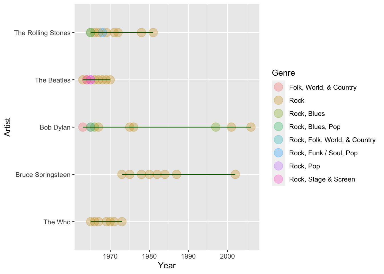
For our purposes, it looks like the genres don’t add much to the story, and the legend takes up quite a bit of space. I also want to add a title.
top_5_artists <- top_albums %>% group_by(Artist) %>%
  summarize(count = n()) %>% top_n(5) %>%
  arrange(desc(count)) %>%
  ungroup %>% inner_join(top_albums)

ggplot(data = top_5_artists, aes(x = Year, y = fct_reorder(Artist, count))) +
  geom_point(size=5, alpha = 0.3, col = "red") +
  geom_line(col = "darkgreen") +
  ggtitle("Most albums in the top 500 albums of all time (1955-2011)") +
  ylab("Artist")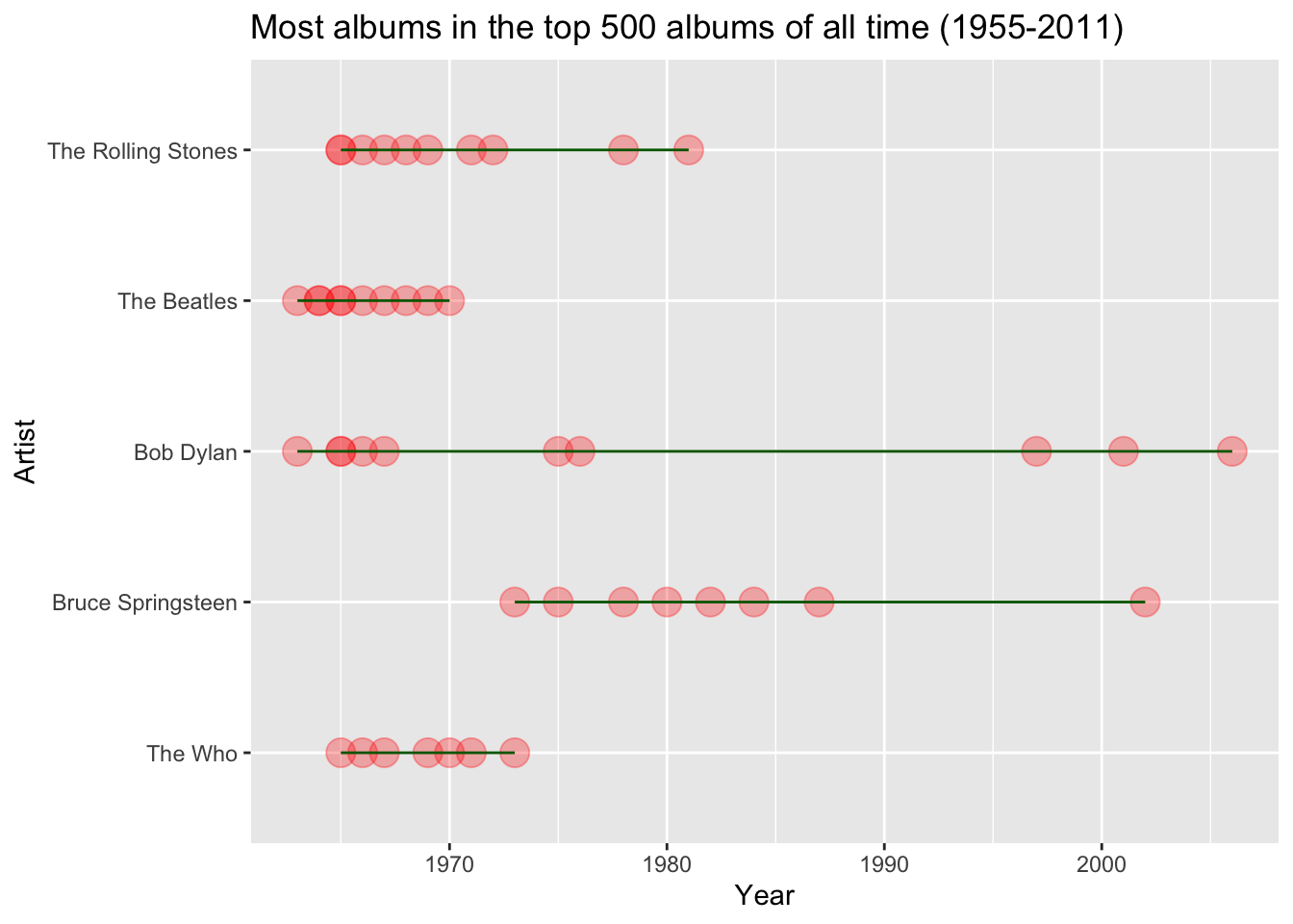
Feel free to review all of the geoms available in ggplot2. T
5.5 DataCamp Exercises
The DataCamp exercises are focused on creating visualizations for others. When we develop visualizations for ourselves, we are often creating them to explore data. When we build them for others, we are creating them to communicate.